Objective
This assignment shows my command of colour in
photography, finding and using colours in deliberate relationships.
I have identified the 4 colour relationships:
Harmony through Complementary colours
·
Red and Green in proportion of 1 to 1
Harmony through Similar colours
·
Blue and Green in proportion of 4 to 6,
·
Green and Yellow in proportion of 9 to 6
·
Red and Orange in proportions of 6 to 8
Contrast through Contrasting colours
·
Blue and Yellow in proportion of 9 to 4
·
Green and Violet in proportion 6 to 3
·
Orange and Green in proportion 8 to 6
·
Red and Blue in proportion 6 to 4
·
Violet and Yellow in proportion 3 to 1
Accented
·
Red on Green background
·
Colour on Grey background
For this assessment I have demonstrated the technical and
visual skills needed to create the images with the desired colour
relationships. I have identified the colour combinations in a number of
locations and have taken great care in creating images with colours in the appropriate
proportions to achieve the effects required. With careful composition and the
use of judicious cropping (only where absolutely required) I have managed to
create images that create harmony via Complementary or Similar colours. I have
also created Contrast through the use of colours two thirds of the way around
the colour wheel.
I approached the project by identifying the images that I
required to show the desired combinations then plotted these against potential
subject matter . Using this matrix I was able to ensure that no combinations
were overlooked. I chose for my categories Street Scenes, Flora, and The
Supermarket. These would give me a range of subject matter, together with
natural and man-made colours.
The photographs were taken on the streets and railways of
London, at Kirkstall Abbey in Leeds, and at the fruit and vegetable section of
Morrisons supermarket. With the exception of the Supermarket images, the images
were created from ‘found’ subject matter. The Supermarket images were modified
arrangements of the food displays creating semi ‘Still Life’ images.
Finding some combinations proved to be a challenge and I
didn’t always have the correct equipment with me when they were found. I have
been reminded that “the best camera you have is the one you have with you”, so two
of the images were taken with a Smart-phone. It’s easy to identify one due to the
equipment’s poor low-light capability which has resulted in an image of poor
quality, but to my mind it still effectively demonstrates the found colour
relationship sought.
Harmony through
Complimentary colours
Complementary Red and Green in proportions 1:1
In
this image of radishes taken in the supermarket I was able to arrange the
product in a way to give the balance of approximately equal amounts of Red and
Green.
Complementary Red and Green in proportions 1:1
In this image taken in China Town there is an approximate
50:50 mix of Green and Red. This was created by careful composition when the exposure
was made. Movement was achieved by waiting for a shopper
to stop in the frame at a position ‘pointed’ at by the dislodged bollard.
Complementary Red and Green in proportions 1:1
In this image of shops in Carnaby Street the balance of
Green and Red was again created through composition. In this case a great deal
more of the Green façade was included to balance out the proximity of the Red
store front. The diminishing perspective adds interest and
movement down the street.
Harmony through
Similar colours
Similar Green and Yellow in proportions of 9:6
The ‘stronger’ colour Yellow appears in smaller proportions
to the Green to achieve the harmonious effect required. This was done by the
moving the vegetables to generate the balance required.
Similar Blue and Green in proportions 4 to 6
More
Blue was required in this found subject to ensure harmony was achieved. The
amount of Green seen was moderated by the inclusion of an appropriate amount of
the dark Green foliage to the right of the image.
Similar Green and Yellow in proportions of 9:6
The ‘stronger’ Yellow sign was controlled during exposure by
varying the amount Green frontage in the viewfinder. The eye is led to the sign and movement is
created through the angle of the frontage.
Similar Blue and Green in proportions 4 to 6
This image was taken outside the Liberty store in London in
evening light.
A greater degree of Blue was included in this
image through the careful placement of the camera above the subject. Taken from
the side, the Blue flowers would have been dwarfed against a wheelbarrow full
of Green.
Similar Yellow and Green in proportions 9:6
Again,
in this image, the relative mix of the stronger Yellow was controlled by the
degree of inclusion of the Green foliage. The lower the camera angle the more
Green was included.
Similar Red and Orange in proportions 6:8
Contrast through
Contrasting colours
Contrasting Blue and Yellow in proportions 9:4
There is significantly greater more of the ‘weaker’
Blue colour in this image than Yellow. Movement is created along the platform by the use of
perspective leading to the departing train.
Contrasting Orange and Green in proportions 8:6
Contrasting Red and Blue in proportions 6:4
This image of newspaper stands in China Town was cropped
to obtain the correct proportions of the ‘stronger’ Red and ‘weaker’ Blue.
Contrasting Violet and Yellow in proportions 3:1
Careful composure was required to ensure the correct
balance of Violet to Yellow.
Contracting Violet
and Yellow in proportions 3:1
Contrasting Blue and Yellow in proportions 9:4
The correct balance of colours for effective contrast
were controlled by the amount Yellow shop front included in the image. This was
done partly during exposure and fine tuned by cropping.
Movement in this photograph taken inside Covent
Garden market was created by the shop frontage pointing at the steel building
structure and by the offset vertical.
Contrasting Green and Violet in proportions 6 to
3
Careful
composition ensured the correct balance of Green to Violet.
Colour accent
Accent of Pink flowers against a background of
Green
There is more than one accent point in this image but the
sea of Green is sufficiently broad to create the desired effect.
Accent of window flowers against building
The
accent in this case works on 2 levels. The first is colour where the flowers
provide a significant contrast to the predominantly grey building. The second
is of a natural element in a strongly man made environment.
 Metered
 +1 stop
 +2 stops
 Metered
 -1 stop
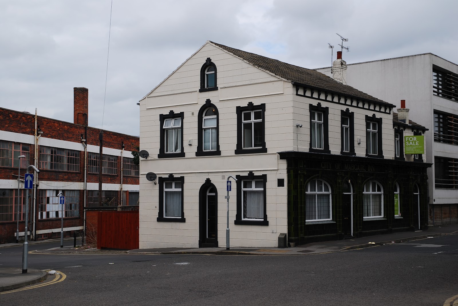 -1 stop
 Metered
 +1 stop
 Metered
 +1 stop
 -1 stop
 Metered
 Metered
 +1
+1 -1
-1


.JPG)
.JPG)
.jpg)
.jpg)
.jpg)
.jpg)
.JPG)
.JPG)


.jpg)
.jpg)
.jpg)
.jpg)


.JPG)
.JPG)


.jpg)
.jpg)

.jpg)
.jpg)
.jpg)
.JPG)
.JPG)

.JPG)


